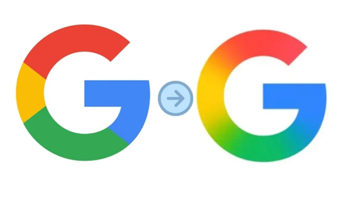
Google's iconic circular "G" logo was modified for the first time in almost a decade. The symbol hasn't changed since September 2015, when the internet behemoth led by Sundar Pichai drastically changed its logo ('Google') to a contemporary typeface called Product Sans.
The four solid parts have been swapped out for a smooth gradient that unifies the colors in Google's updated version. The updated design reflects a change in Google's wider visual language by introducing a softer, more vivid feel. It strongly resembles the gradient design used in the most recent Search app UI upgrades and Gemini AI branding.
Google's growing emphasis on artificial intelligence and its intention to communicate this change through both product innovation and visual identity are in line with this.
Users of iOS can now see the new gradient logo through the Google Search app, and some Android devices have started to display it thanks to the beta release of Google app version 16.18. While the majority of web platforms continue to use Google's classic six-letter wordmark, Pixel smartphones are among the first to get the upgrade. The upcoming weeks should see a broader spread across operating systems and services.
